


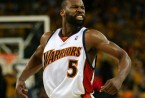


DeMarcus Cousins had a breakout year, reaching the vaunted 20-10 average and capitalizing on his potential. What’s most impressive that his usage rate (the proportion of possessions he used by taking shots, free throws, or making turnovers) ballooned without a decrease in efficiency — in fact he was more efficient than ever. A usage rate of 32.7 is elite, far beyond the range of the typical player, especially for someone in the frontcourt. Since 1990, the only centers who have reached a 30 usage rate (with 1000 minutes played) are Ewing, Robinson, Olajuwon, Shaq, and Yao, who was the last to do it seven years ago. (Arguably, Amar’e Stoudemire counts in 2011 in his first year for the Knicks.) That is legendary company, and he accomplished this at the age of 23. Unfortunately, it was another woeful season for Sacramento, and they finished 20th in offensive efficiency. They were effectively in the same class as the Detroit Pistons, who had a failed season integrating Josh Smith (with perhaps the worst jump shot in the league), and the lost season from the Lakers who were sending out a team of C-level talent after Kobe went down. How do we account for Cousins’ monstrous usage rate on such a poor offense?
We can translate a player’s usage rate by studying a subset of players who changed teams midsesaon. Midseason players are targeted because age will not be a variable, and excluding the players traded the team is assumed to be largely intact. If you looked at players who changed teams in the offseason, then roster shift would be more of an issue. Reaching back to 1986 when we have complete gamelogs, there are 109 players who have switched teams and racked up 800 minutes on both. The graph below shows how a player’s usage rate changes with respect to his team’s offensive rating compared to league average. (Offensive rating is adjusted for strength of schedule via b-ref.) Basically, on the bottom you go from a change in offensive rating of -10, which means you go from a poor offense to a great one, and to a rating change of 10, which is a great offense to a poor one. And on the other axis, it’s the same story where positive means you’re taking more shots and negative means you’re taking less.
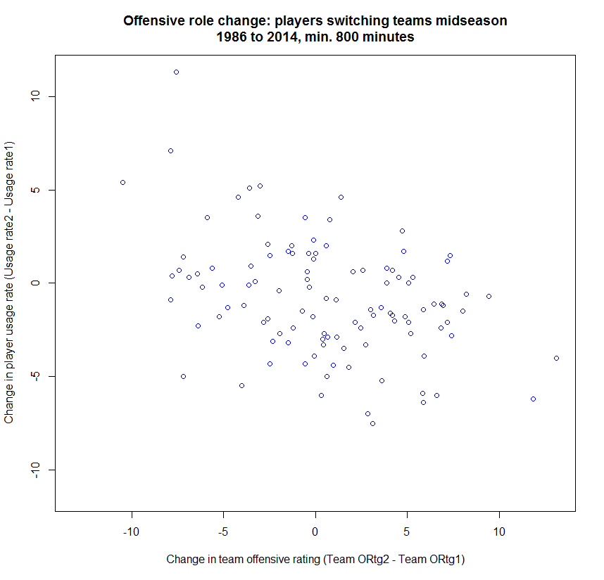
There’s a bit of a mess of data points, but the trend is there. Your share of a team’s offense generally decreases when you move to a better offense. For instance, James Posey was on Denver, the worst offense in the league by far — actually one of the worst offenses ever — and then got shipped to Houston, who was ranked 13th. His usage rate in Denver was 22.2, which is decently above average; in Houston with competent teammates it dropped to 16.0. He turned into a role player with Yao and Steve Francis as the options. Shaq, oddly enough, is the other dot on the far right — he got shipped from an offense ranked last in Miami to one ranked second in Phoenix. His usage dropped to a mere 21.3 from 25.3.
Additionally, you have someone like Juwan Howard, who got transformed from one of the greatest modern offenses — Dirk with Nash in 2002 — to the aforementioned Denver team, though this was a year earlier. Juwan’s usage on Dallas was near average at 20.3, but consequently on a Denver squad bereft of superstar offensive talent his usage rate climbed to 25.7.
This is all descriptive and isn’t rigorous, however. Not unlike betting on the NBA, which is also very predictive in nature. You can make NBA predictions here. The graph shows how noisy the results are. Thus, a simple regression is applied on the data to check for statistical significance: it’s highly significant at a p-value of 1.3e-5.
Another important output of the regression is the usage coefficient. It’s intuitive that your role is decreased on a better team, but the real prize here is the magnitude of this change. For every one point positive difference between two teams, the player’s usage rate will drop by 0.27 points.
What’s this mean? A ten-point change, like from the last-place 76ers to the 8th-ranked Phoenix Suns, results in a 2.7 change in usage rate. This isn’t an enormous difference, but it’s not trivial either. It’s the difference between LeBron and Curry ranked 5th and 10th, respectively, out of every player in 2014 with at least 1000 minutes. But that’s at the fat-end of the bell curve. A difference of 2.7 usage points is also the difference between Lawson at 78th and Brian Roberts of the Pelicans at 120th (for a more familiar name, it’s also near Ibaka.)
Side-note: if you’re worried about how I’m using a team’s offensive rating for the entire season rather than just during the time the player was with the team, I repeated this analysis with 38 players who had at least 1000 minutes on each team, although this time I couldn’t use adjusted offensive efficiency. The results were similar with a coefficient of 0.23 rather than 0.27. However, this was within the range of natural variation as it was less than one standard error away — with a smaller set of players, there was more variation. The p-value was still 3%, which is borderline significant, but that’s remarkably low given there were only 38 players. I’d assert that using a team’s rating for the entire season is sufficient and the effect is real.
Let’s see a real-world application of this by reconfiguring a top 20 usage list. For example, Al Jefferson was a hair above Blake Griffin, but their teams’ offenses were considerably different. Shouldn’t we correct for that?
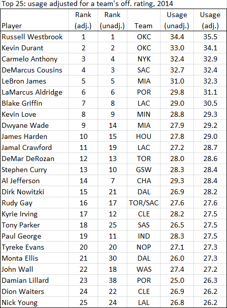
The table above corrects for this. Usage is adjusted to reflect the predicted usage on an average offense using the regression results discussed previously. Correctly, AL Jefferson drops seven spots, and oddly enough he’s the only large change in the top 9. After that there are a few drastic differences. From looking at their raw usage stats, John Wall looks like more of a “shot creator” than Lillard, but Portland nearly had the best offense in the league. Adjusting for that and they’re neck-and-neck. For a more extreme example, Tony Wroten on Philadelphia had the 16th highest usage rate out of everyone with at least 1000 minutes. He was one spot behind James Harden and another behind Wade. Adjusting for the team? He falls to 31st around non-all stars like Brandon Knight and Bledsoe.
You’ll notice Cousins hasn’t fallen much. The Kings were closer to average than awful, and usage is changed to an environment on an average team. Even if he were on the Clippers, the league’s best offense, his adjusted usage would still be 30.9, still above the magical 30 number. The point of this exercise is to allow for some educated adjustments for guys on different teams. The fact that there’s a lot noise shouldn’t invalidate the results but inform them: some guys, like Posey, may adjust when they have better teammates, and others, like Kobe, may gun even when playing with other stars. The effects are often modest, and it’s not a shock this effect exists, but it’s extremely important to understand the actual magnitude and the range of possible results. Lastly, I had always wondered if you could think of different teams having different “average” usage rates, ranking them like we do with points per game or offensive efficiency. And perhaps the best method of estimating this is looking at how players are affected when switching teams, as I’ve done here.
DeMarcus Cousins is playing for a poor offense, but his gargantuan usage rate for a center shouldn’t be dismissed. It’s rare, and we now have evidence it’d be high even for a great offense. How Cousins will develop from here is the crux of what makes the NBA so intriguing.